5 Design Principles to Make Your Projects Stand Out
What makes good design? In other words, how do you make something look beautiful and function well? Other art forms like painting can’t really be measured objectively, but design always has a purpose, meaning it can be either successful or unsuccessful. Whether it’s interior design, fashion design, graphic design, web design, or brand design, there are certain principles that need to be followed in order to make your design both functional and appealing.
For example, if you send out some gorgeous wedding invites and then get a bunch of texts asking what time the ceremony is, your design was unsuccessful: It was appealing, but not functional. If you put up a detailed poster for an event, but it’s simply black text on white paper, there probably won’t be many people in attendance: Your design was functional, but not appealing. To create good designs in any medium, you need to hit the sweet spot between function and form.
There are many visual design principles out there, but this article will outline the five most important: Alignment, balance, contrast, repetition, and proportion. By becoming familiar with these five design principles, you’ll learn to recognize when designs are working, when they’re not working, and how you can fix them. You’ll also have a much stronger starting point when creating your own designs, whether you start with a template or from scratch in the Graphic Designer.
What Are the 5 Principles of Design?
Depending on who you ask, there are up to twelve basic principles of design. These principles apply whether you’re designing a website, an Instagram story, or a T-shirt. But the rules often overlap and can be difficult to keep track of. We’ve narrowed it down to the most important so that you can streamline your design process. As long as you keep these fundamentals in mind, you’re sure to create a beautiful and effective design every time.
The five basic principles of visual design are:
- Alignment
- Balance
- Contrast
- Repetition
- Movement
You might not know the terms, but if you have an eye for design, you may find that you’re already familiar with these concepts. That’s because the human eye is naturally drawn to visuals that implement these five basic principles!
1. Alignment
Alignment is one of the simplest and most straightforward principles of design. Essentially, you should align all your design elements with each other for the most cohesive look! In graphic and web design, this could mean aligning the edge of your text with the edge of an image, aligning your images with each other, or aligning everything on the center of the page.
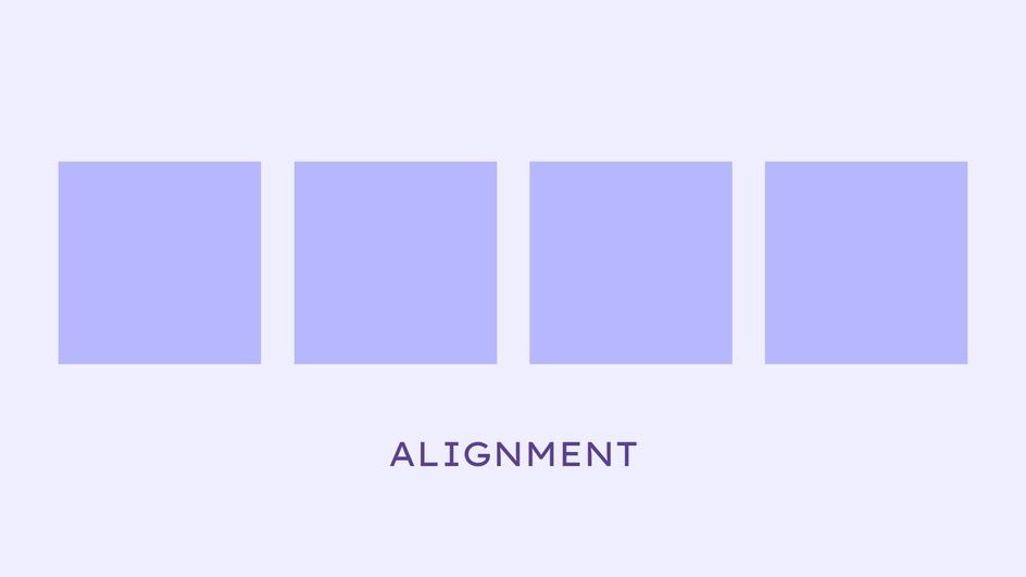
This principle comes naturally to most people, to the point where it can be easy to overlook. You wouldn’t spare a second glance at a graphic design that’s in alignment, but you will notice if a design is out of alignment by even a few pixels.
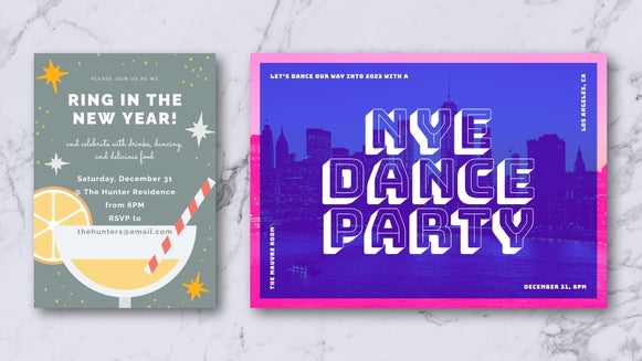
In this Twitter header, the images are placed diagonally, but it doesn’t feel messy or disorganized. This is because the images are still completely aligned with each other.

If something about your design looks a little off, you may want to make sure that all your elements are correctly lined up! You can always use the blue guidelines in the Graphic Designer to double-check.
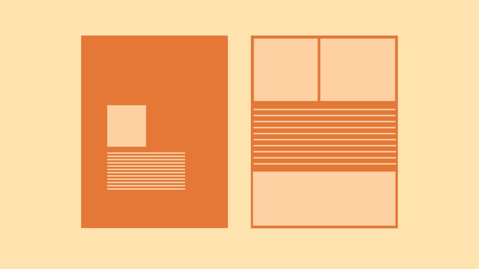
Typically, graphic and text elements will be either left-aligned (along the left side of the page), center-aligned (directly in the middle), or right-aligned (along the right side of the page).

As you can see from this flyer, you can always use a combination of alignments to create a perfectly balanced design — which brings us to our next principle.
2. Balance
Balance in design means distributing visual weight evenly. A design with all its elements placed in one spot will look uncomfortable and claustrophobic. A design that is correctly balanced will have elements spread out across the page, making it easy to look at.
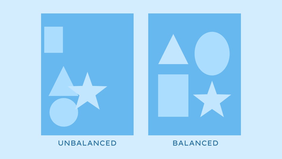
Balance is related to the secondary design principle of negative space, also known as white space. This is any area in your design where there are no elements at all. There should be a good balance of positive and negative space in your design. Too much negative space and your design will look barren, like in the design on the left. Too much positive space and it will look overcrowded, like the one on the right.
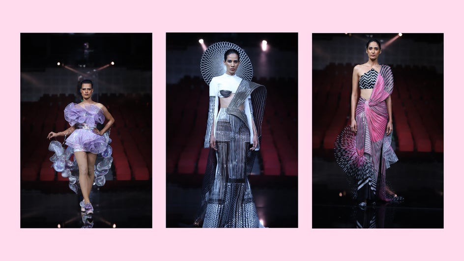
You can visualize the principle of balance easily in fashion design. Everyday clothes like pants and shirts typically have symmetrical balance. On the runway and red carpet, designers experiment with asymmetry, but their finished designs must still have both visual and physical balance. Any weight placed on one side is matched somewhere on the other side.
When it comes to graphic design, symmetrical balance looks neat and orderly. It can give your design a sense of competency, and should be used in professional settings or when there are large amounts of text. Asymmetrical balance comes across as more natural and organic. When utilizing asymmetrical balance, make sure you’re not just haphazardly throwing elements on the page; rather, keep some elements aligned with each other.
3. Contrast
If you want your design to stand out and grab attention, you’ll need to use contrast. This can be contrast between colors, shapes, textures, and more. Contrast between sizes is also known as the design principle of proportion.
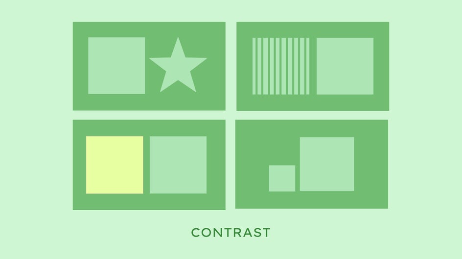
Contrast will make your design visually stimulating. It will also help your viewer differentiate your design elements. You can use contrast to emphasize the most important parts of your design, like in this poster where size and color are used to highlight the “Shop Small, Support Local” Text.

Contrast is also vital when it comes to accessibility. Any text in your design won’t be legible unless it contrasts enough with its background. If you’re having difficulty making the text visible in your designs, try using a different blend mode or adding a color overlay to the background.
Don’t forget that your design should still look cohesive. If there are too many different things going on in your design, your viewer will get overstimulated and won’t be able to process what they’re looking at. So use only a few different types of contrast at a time!
4. Repetition
The design principle of repetition is exactly what it sounds like: Repeating visual elements throughout one or more designs. This creates visual consistency and leaves an impression on the viewer.
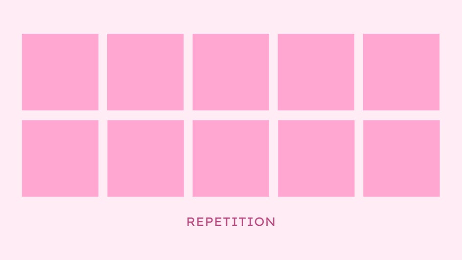
Repetition is particularly important in brand design, where you want your audience to be able to recognize your brand at a glance. By repeating specific fonts, colors, and graphics, your audience will always be able to link that aesthetic back to your brand. Just think of Apple’s iconic minimalist look or the famous McDonald’s arches.
This is why successful brands curate their social media posts very carefully, including having a consistent color palette, and why influencers are so obsessed with having an “aesthetic” Instagram grid. It’s not just about looking pretty, it’s about having a strong visual identity that will be remembered and recognized instantly.
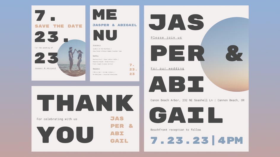
Creating a strong visual identity is also important in event design and planning. That’s why you can get these DIY wedding printables in matching sets!
More practically, repetition helps to avoid confusion. Any UX designer will tell you that it’s important to repeat the same general page layout on a website — headers, footers, buttons, and navigation — so that your user always knows where to click. Inconsistency in fonts, graphics, and other design elements will throw your audience off track and leave them feeling dissatisfied.
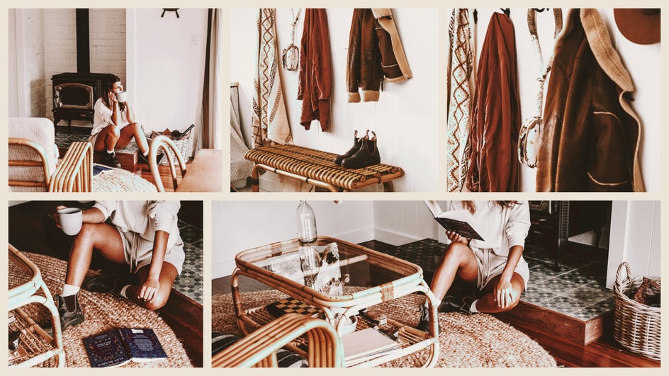
Repetition also helps your credibility. For example, if you run an Etsy store, you should always take product photos in a similar light and location. This makes your business more consistent and therefore trustworthy. You can use the batch editing feature of the Photo Editor to edit all your photos at once and make sure they look cohesive.
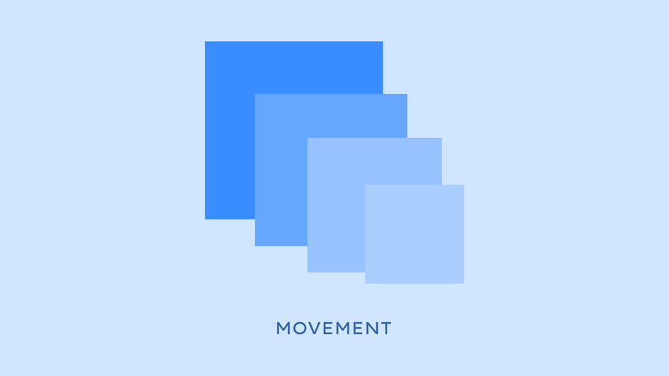
5. Movement
The movement of your design dictates where and how your viewer’s eyes should travel. You can purposefully direct your viewer’s eye in a particular direction using repetition, alignment, contrast, and rhythm, which is the spacing between design elements. You can use just one of these design principles to indicate movement, or a combination.
In English, we naturally read from left to right and top to bottom. This means that if you’re designing a menu, you’ll probably want to put your appetizers in the top left corner, while dessert goes in the bottom right. This natural flow should be followed in other text-heavy designs like magazine spreads and book layouts.
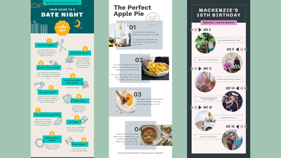
However, in designs that allow for more negative space, you can redirect the natural path of the eye without confusing your viewer. When it comes to infographics, slides, and other designs where there’s a lot of information being presented, placing elements along a curve creates movement while simplifying flow.
Because there are many ways to affect the movement of a design, this principle is fairly advanced. But once you get the hang of it, you’ll be able to direct your viewer’s eye wherever you choose!
Elevate Your Work Instantly With These 5 Design Principles
By implementing these tried-and-true design fundamentals, you’ll be able to simplify your thinking process and design with intention. You’ll also instinctively know what’s wrong with an off-putting design, and be able to fix it quickly instead of using trial and error. Following these principles is the simplest way to create a successful design every time!
Now that you’ve learned the five most important visual design principles, it’s time to use them for yourself. Just head on over to the Graphic Designer and put your new skills to the test!