Using Complementary Colors to Make Your Photos Pop

Color is all around us. We’re taught about it from a young age, from memorizing all the hues of the rainbow to learning how to mix paints. As such, you might think that using color in your photography is simple and straightforward. But color also has a depth and complexity that most people don’t think about. When you’re more thoughtful about how you use color, you can elevate your photographs to the next level.
Color theory goes far beyond a paint palette. The colors you use dictate the entire tone of your image, and will change a viewer’s feelings depending on the hue, saturation, warmth, and contrast.
This may all sound complicated, but the basics of color theory are easy to learn. Once you learn how to make strategic color choices, your life as a photographer and artist will change for the better! In this article, we’ll focus on heightening complementary colors in the Photo Editor so that your images really pop.
What Are Complementary Colors?
Colors occur on a spectrum. Think of your traditional rainbow: Red, orange, yellow, green, blue, purple. But now imagine that this spectrum loops back on itself. Red leads back to purple.
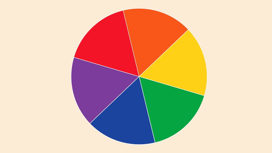
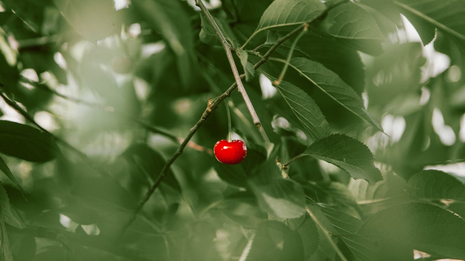
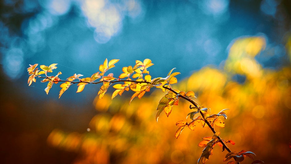
This spectrum, when laid out on paper, is called a color wheel. Complementary colors are colors that are opposite each other on this wheel. These colors have the greatest amount of contrast between them. When they’re next to each other, each color looks brighter and more vivid than it would alone. It’s the reason a red berry against green leaves catches our eye.
Ever uncertain about what counts as a complementary color pair? Just check out this color wheel, or look for one online. If you don’t have one handy, remember that when it comes to complementary colors, one color is always warm (red, orange, yellow) and the other is always cool (green, blue, purple). This is why the contrast between complementary colors is so intense!
Examples of Complementary Colors
The traditional color wheel gives us three complementary color pairs: Red and green, blue and orange, and purple and yellow. But expand your color wheel and you can also see a wider range of complementary colors. In the wheel below, we get teal/tangerine and lime/magenta.
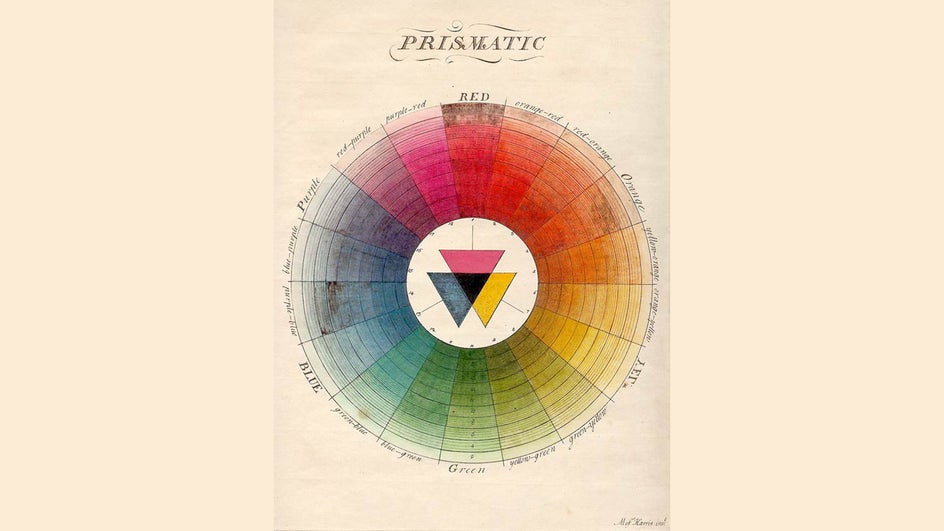
Are you starting to see a pattern between warm and cool tones? Keep these examples in mind when thinking about complementary colors. The more you use a color wheel, the easier it will get.
Why Use Complementary Colors?
Basically, complementary colors provide contrast. Contrast adds a great amount of visual interest to your photos, giving you the boldest, most dramatic looks. Contrast will make your images stand out and help your colors look most vivid. (Stand out on social media by using complementary colors in your branding palette!) If you’re aiming for a bold look or want to emphasize your subject while still looking sophisticated, complementary colors are for you.
Editing Complementary Colors in Your Photos
Sometimes you want to capture a complementary color pair while taking photos but never get the chance. Or maybe you already have an image with contrasting colors, but they aren’t as bold as they could be. Not to worry! No matter what the colors look like in your original photo, you can make them more vivid and enhance your image’s overall look by creating complementary colors in the Edit tab of the Photo Editor.
First, determine what colors are already in your image. If you’re not sure which colors to emphasize, try out the automatic Photo Enhancer to see which colors are brought to the forefront.
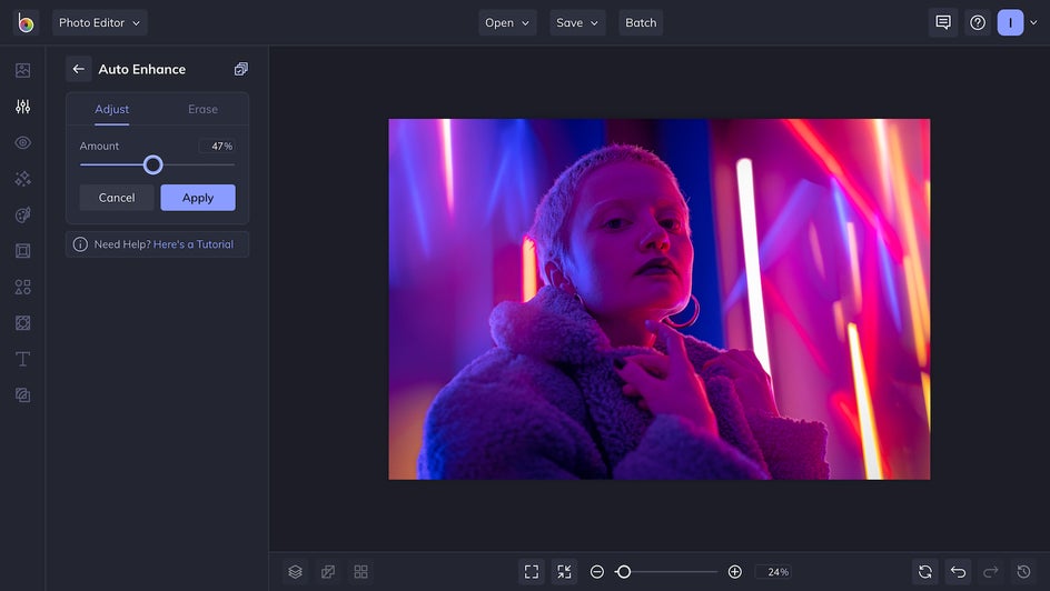
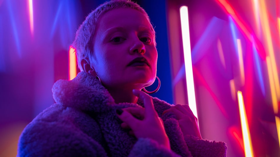
If your colors aren’t already complementary in some way, decide which hues you want to keep. This image already has great colors, but the subject blends in a little with the background. Here, I decided I wanted to keep the purple tones of my subject.
Next, find that color’s complement. Looking at our color wheel, we find that the opposite of purple is orange. My background is currently pink and red, so we want to edit it these colors to be orange. We’re in luck: We can replace entire colors without losing the integrity of the photo. You might have to replace a few colors to get the exact look you want.
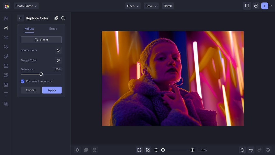
Once the colors in the image are complementary, the rest is a breeze. Play around with the tools in the Color and Exposure tab to increase contrast, adjust temperature, emphasize shadows, add saturation, and more. The world of color is now at your fingertips!

Here’s our finished photograph, more vivid than ever:

Make Your Colors Pop With BeFunky
Now that you’ve learned some basics of color theory and have seen what complementary colors can do, you’re more than ready to try them out in your own photography! Intensify your color palettes and make your photos pop. Just head on over to the Photo Editor to get started.


