Color Toning, Exposure Edits And More With The New Levels Tool
One of the most common problems amateur photographers face is that little thing we like to call exposure. You can think of exposure in the vaguest sense as the lightness and darkness of the image, but in reality it’s really the result of how much light your camera captures at any given point. Common issues with exposure often include underexposure, in which the image is too dark and appears muddy, or overexposure, in which too much light in an image can leave it “washed out”.
For aspiring photographers looking to refine their photos, the Levels tool in Photoshop has always been a great resource to help edit the brightness levels of an image histogram. And since we here at BeFunky consider ourselves champions of taking all that’s fancy & breaking it down into the most accessible, easy to use photography tools, we decided to up our game and bring the levels to us.
With that being said, let’s warmly welcome our newest friend to the BeFunky team: the new Levels Tool in the Photo Editor. Let me break it down for you real slow and easy-like.
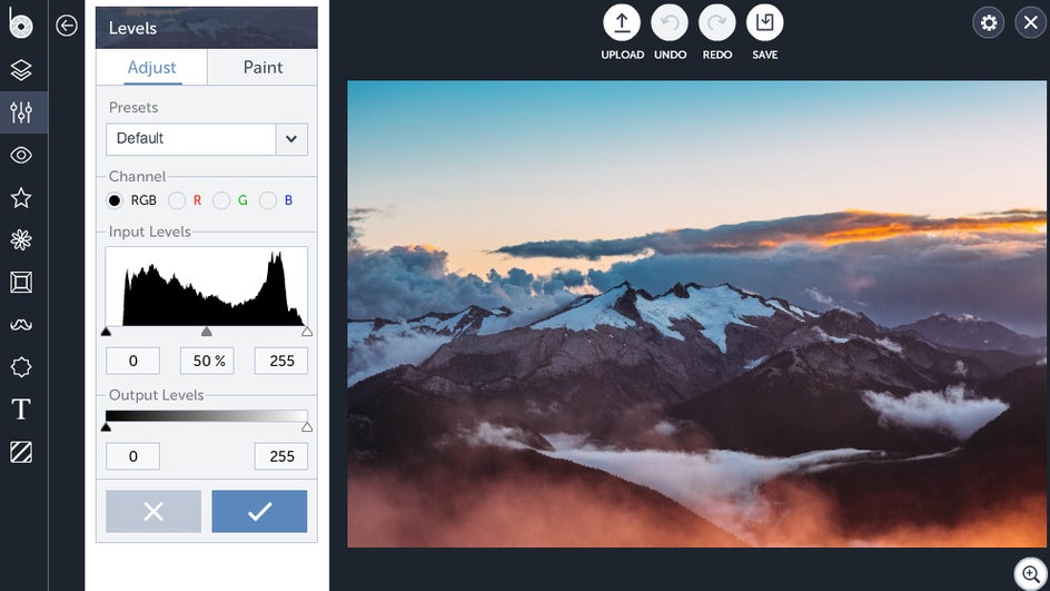
This bad boy is an image histogram. Shadows present in the image are represented with spikes on the left, with the blackest of black representing 0 on the scale. The values in the middle are, of course, your mid-tones, while highlights compromise the right end of the scale.
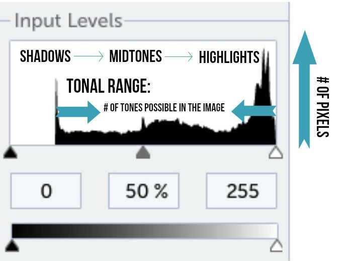
This handy little graphic from Cambridge in Color helps put things into perspective, showing you which values on the histogram correspond to their real life counterparts:
The Levels Tool allows you to adjust things like brightness and contrast by letting you manually determine which values are pure white, black or even your mid-tones. By doing this, you’re essentially stretching the tonal range of the image out as you make the darkest areas in your photo pure black and change the lightest areas to pure white. The wider the tonal range in your photo, the better contrast you’ll end up with.
Since most images look their best when you utilize the full range of dark to light (from 0 to 255), it’s to your advantage to go in and manually adjust the white and black sliders. But how?
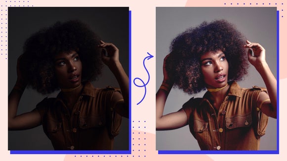
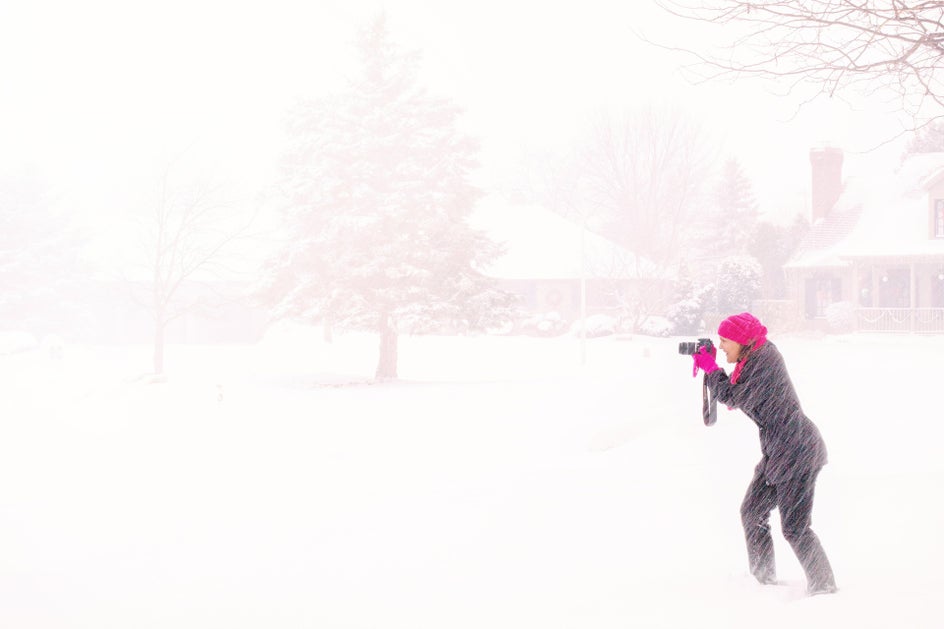
Start by uploading a picture—ideally one with a good tonal range, or a variety of shadows and lights present—into the Photo Editor. Open the Edits panel and select Levels from the Miscellaneous section. You’ll then be greeted with a nice histogram panel. If your histogram shape is leaning to the left it means you have a lot of shadows in your image (called a low key image) which means it may be underexposed.
Vice versa for high key or overexposed images: most of your values will show up as spikes in the highlights region on the far right, indicating there’s too much light in the photo.
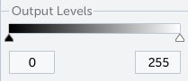
Beneath the Input Levels layer you’ll see a bar beneath for Output Levels. The Output Levels defines the tonal range, so shortening it forces the image pixels to look more alike—decreasing your contrast.
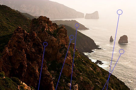
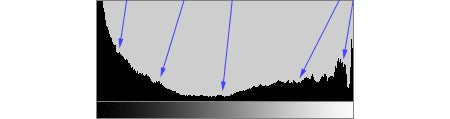
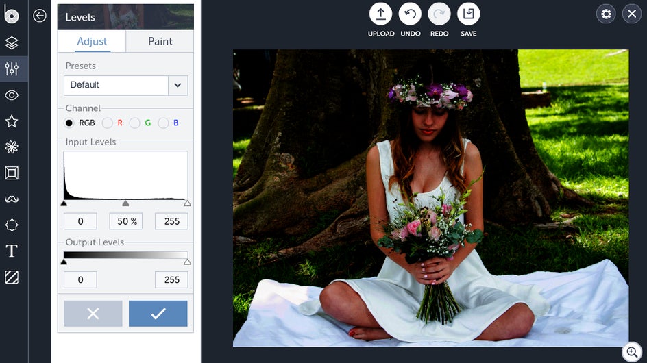
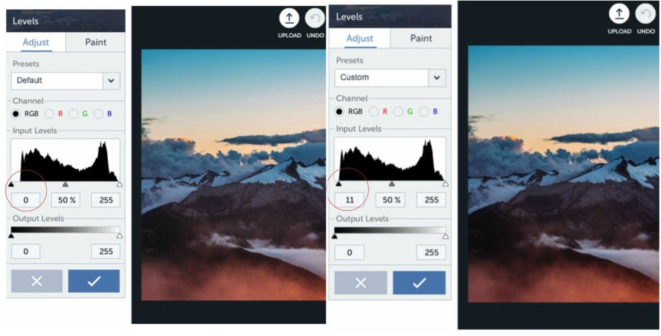
Notice how the image below has a spike that doesn’t quite start at 0?
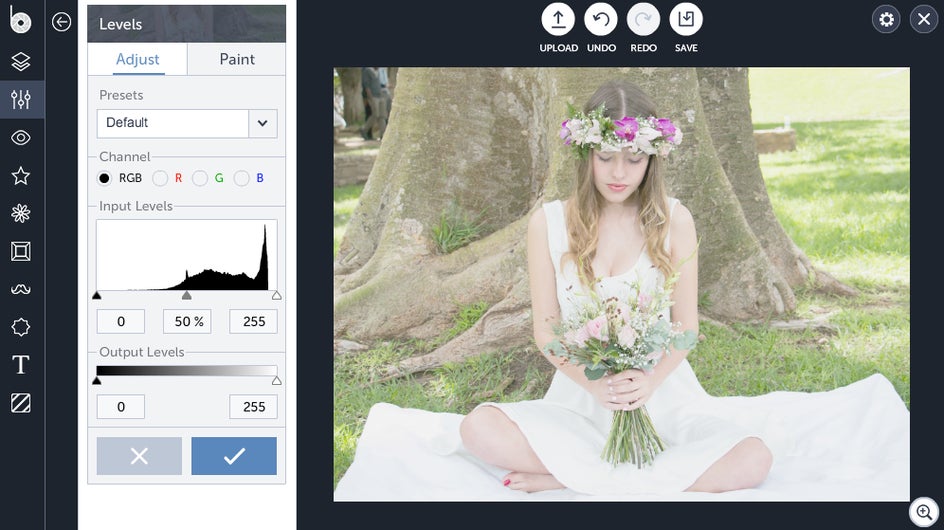
By moving the black slider located at the bottom left a little more to the right so that it lines up with the beginning of the spike, we’re setting the darkest parts of the image as close to black as possible, increasing contrast in the shadowed areas:
A good rule of thumb is to make sure your black and white sliders are always aligned with the most outer point of your spikes.
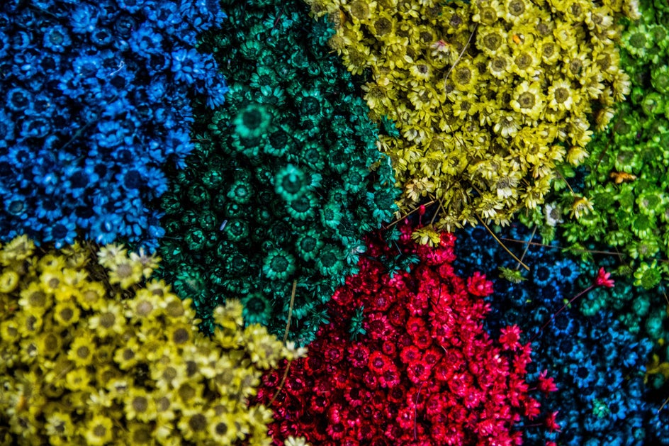
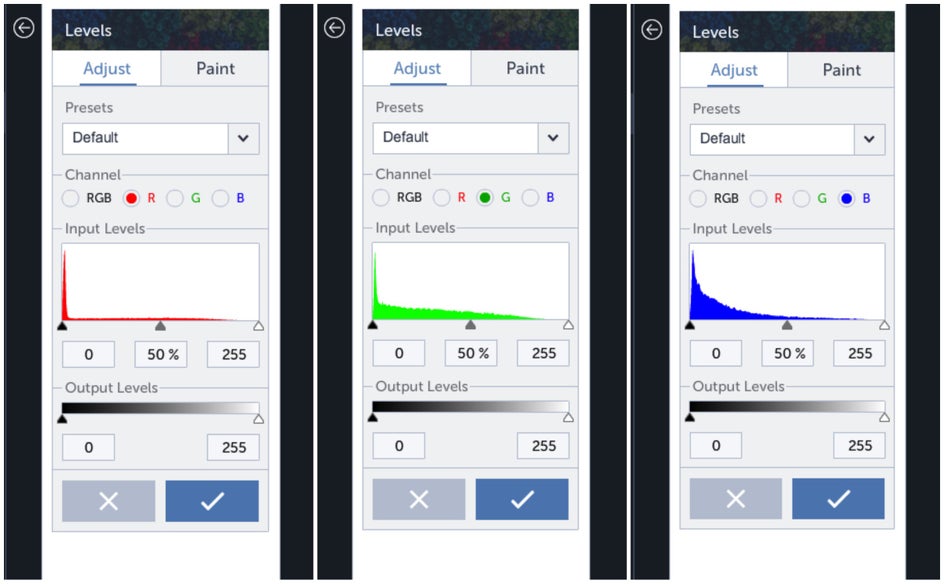
Since each photograph is composed of three basic colors (red, green and blue), an RGB image histogram shows you the value of each color present in the image. You can see this more clearly in colorful images:
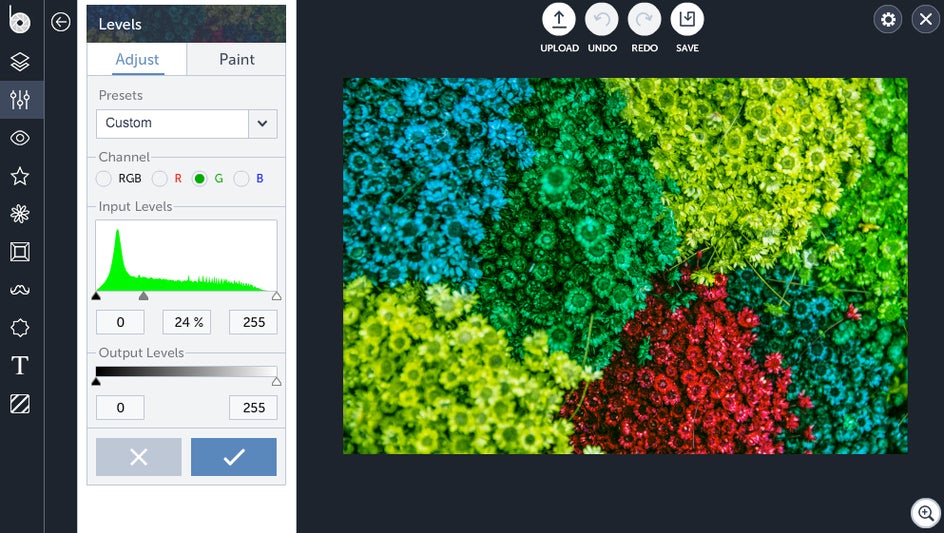
Move the sliders around to play around with your colored tones (and reveal all sorts of wacky effects) for some fine-tuned color toning. Say you want to amplify the green in this photo: by pushing your mid-tone slider to the left, you’re forcing all of the green tones into the highlights area on the right, increasing the amount of green light in the photo.
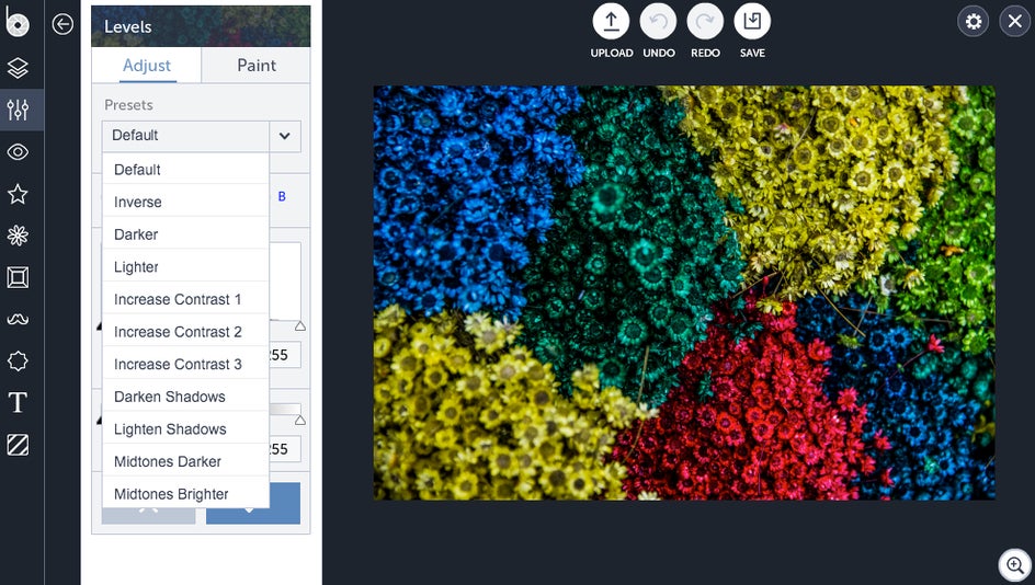
If all this photography shop talk has got your head spinning, don’t you worry your pretty little head. There’s a whole range of different presets available for your convenience:
And finally, you can adjust the Output Levels slider on the bottom to play around with contrast on your photo:

Now go forth into the world and put all this learning to good use while I pour myself a nice hot chocolate.