Play That BeFunky Music: Creating Band Posters
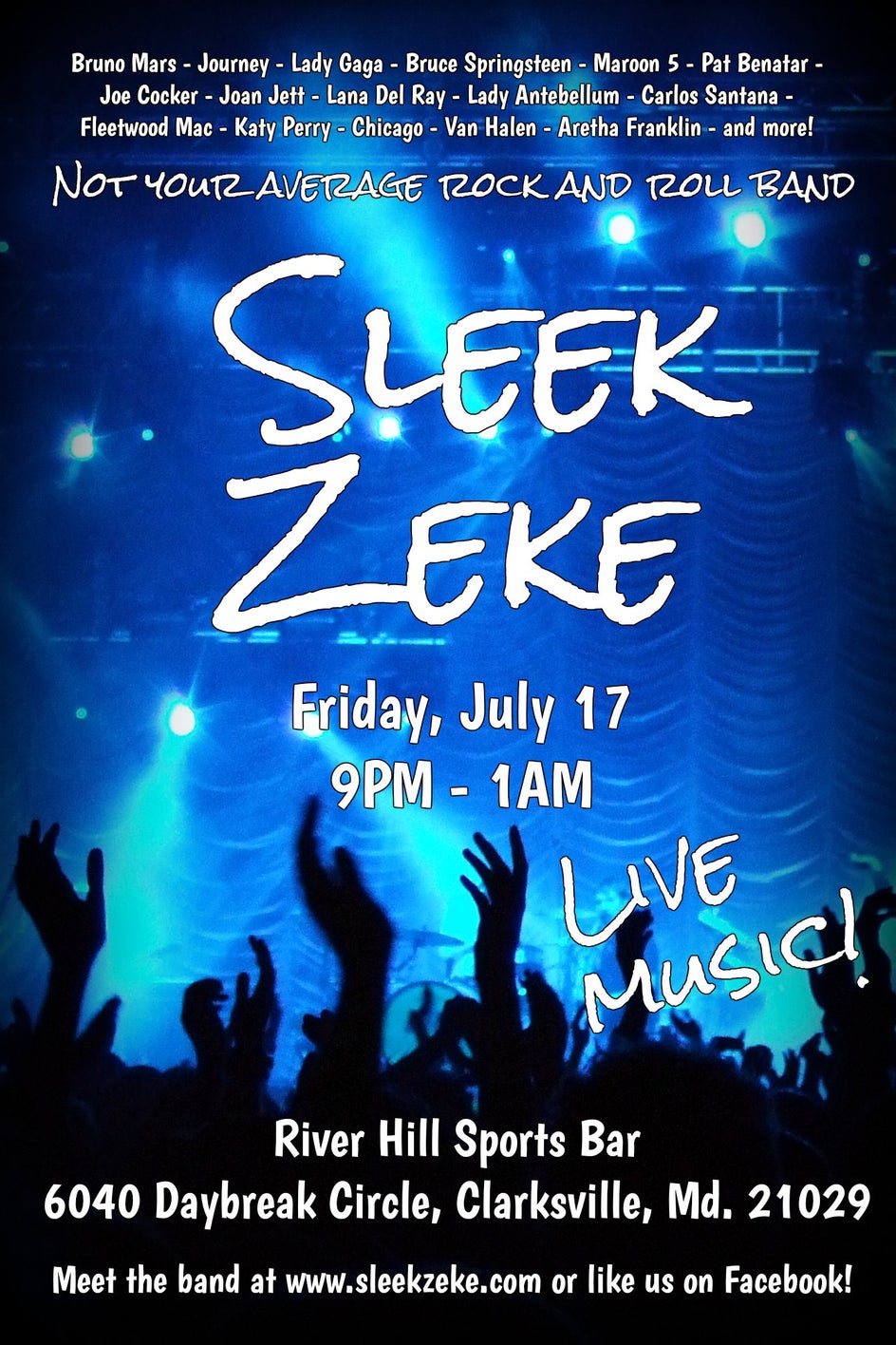
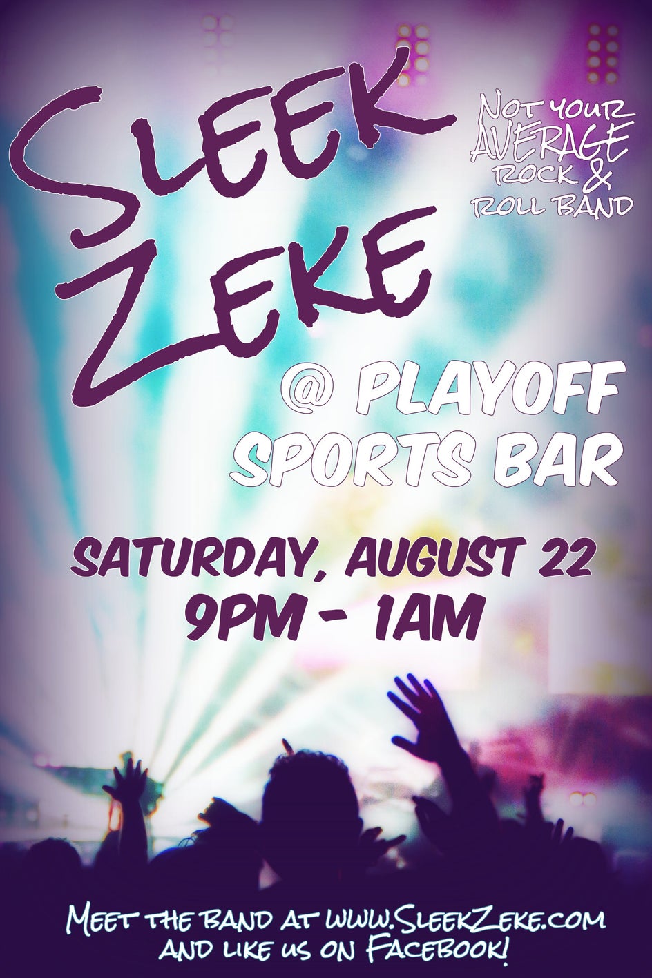
Energy, applause, the dance floor a blur of motion as people groove to their favorite hits...few things are more exhilarating than playing in a rock band and giving the audience a great show. But we'd be playing to an empty room unless we advertised. The BeFunky Photo Editor lets me create slick, professional posters for each of my band's performances. Here's one I did for a gig last month:
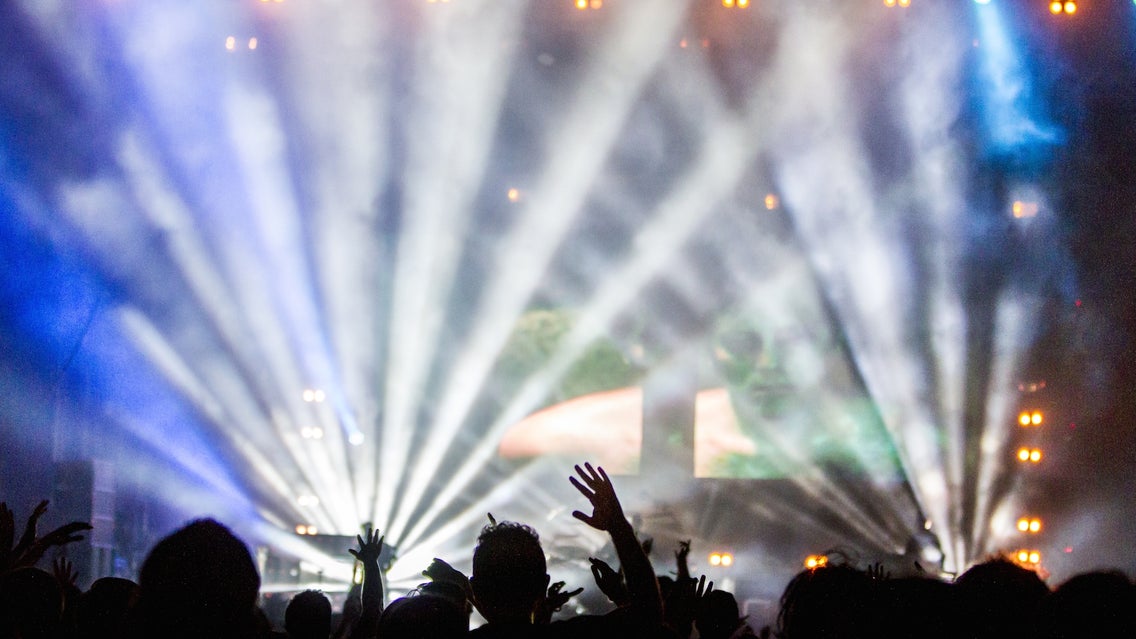
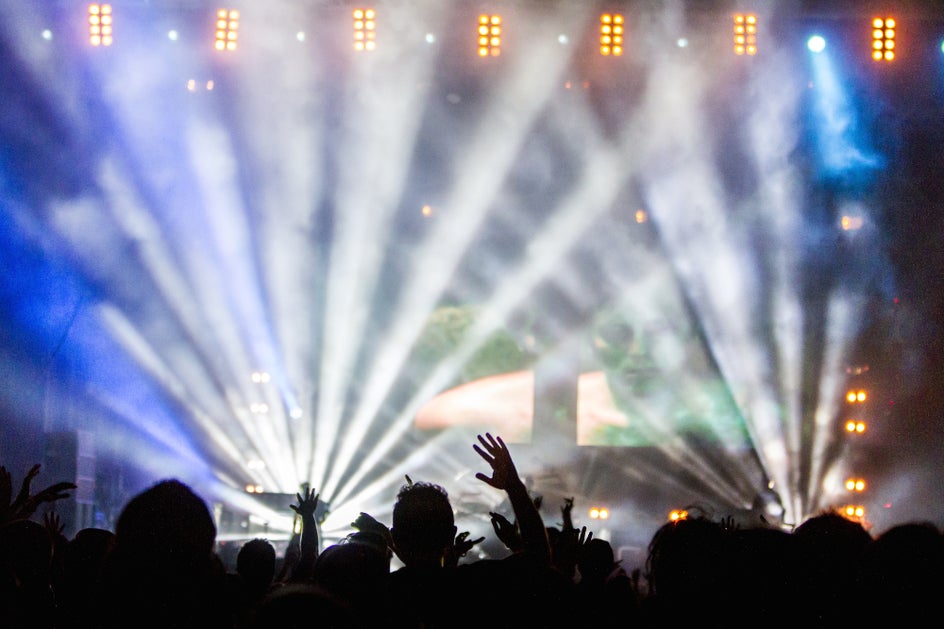
Every eye-catching event poster begins with a background image. A search in Pixabay returns over 700 hits for the term “concert”: I chose one that evoked a live music experience, but with plenty of clear space to accommodate text.
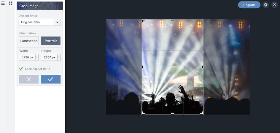
After uploading the image to the BeFunky photo editor, Crop it to an appropriate poster size. For an 11x17 print, I uncheck the “aspect ratio” lock, input a width of 1100 and a height of 1700, then turn the lock back on. This will maintain the frame proportions as I adjust to capture whatever part of the image I want to use.
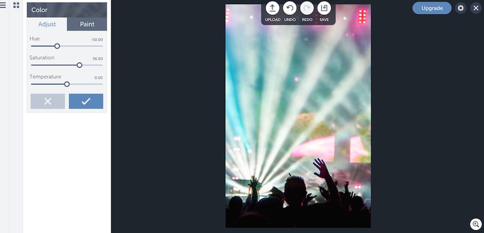
Now I've got the shape of my poster, but I want to punch up the color. Easy! Using the Color menu, I adjust the hue and increase the saturation.
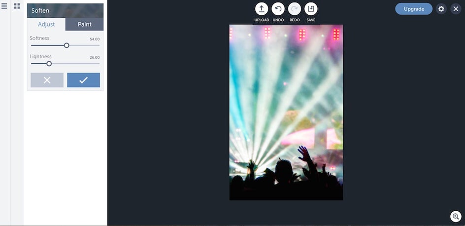
Those people at the bottom have their hands in the air like they just don't care, but I care, because up close the detail is a little distracting. The Soften tool takes care of that, smoothing the groupies into tasteful silhouettes.
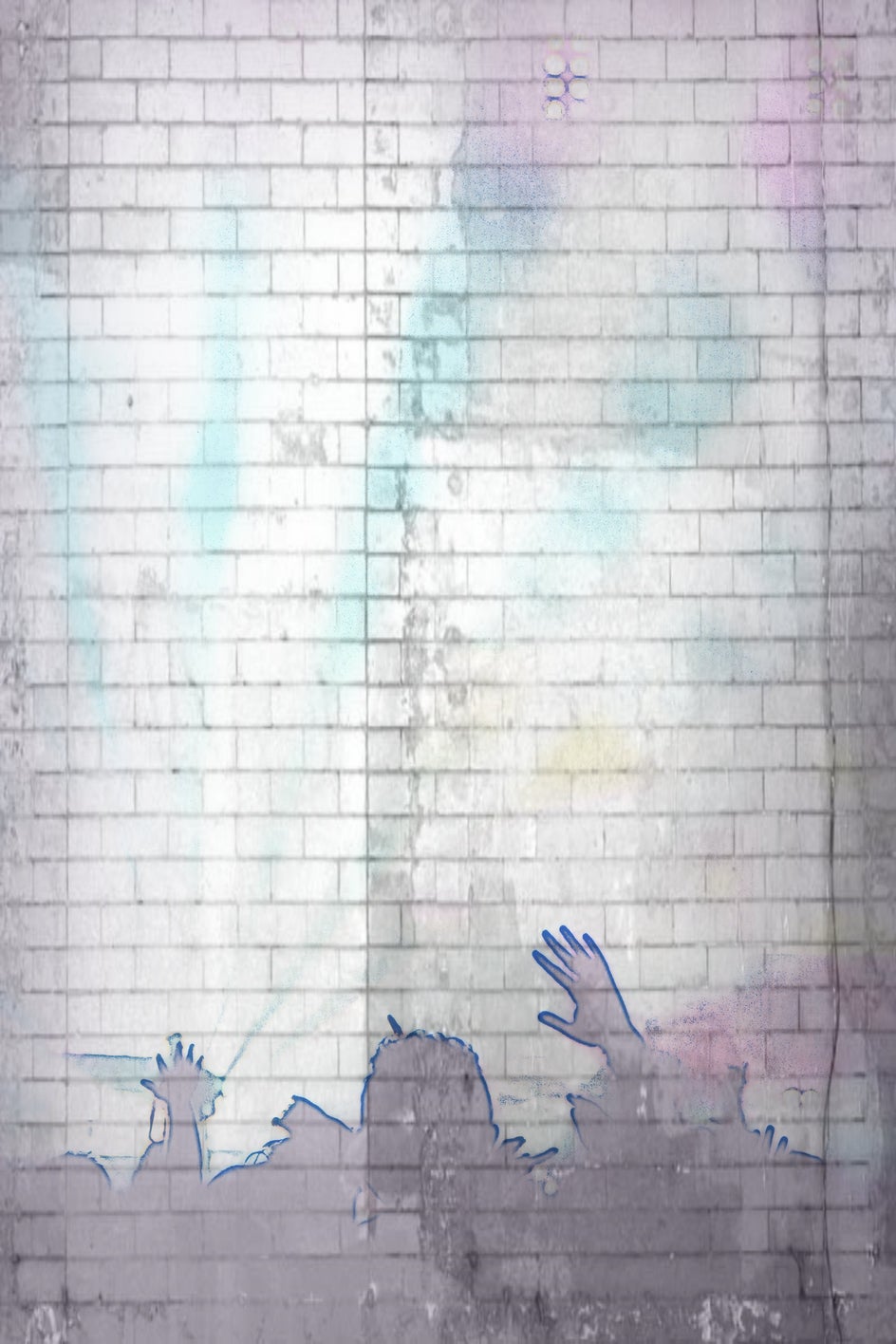
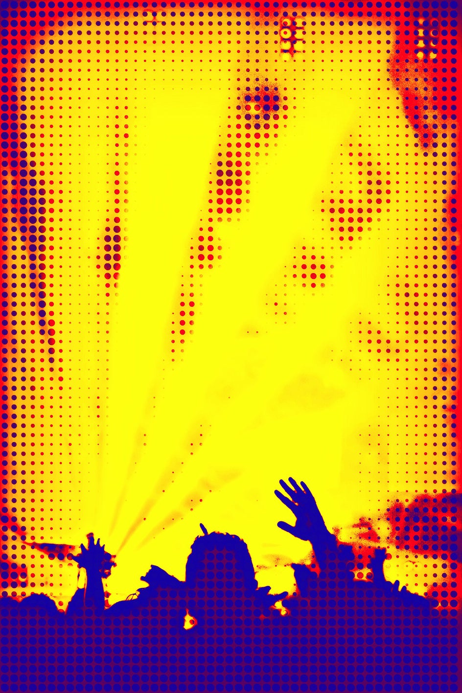
Now comes the fun part: choosing visual effects! BeFunky lets me combine effects for almost limitless possibilities. I could pay homage to Pink Floyd with Stencil, or do a molten Andy Warhol impression with Pop Art.
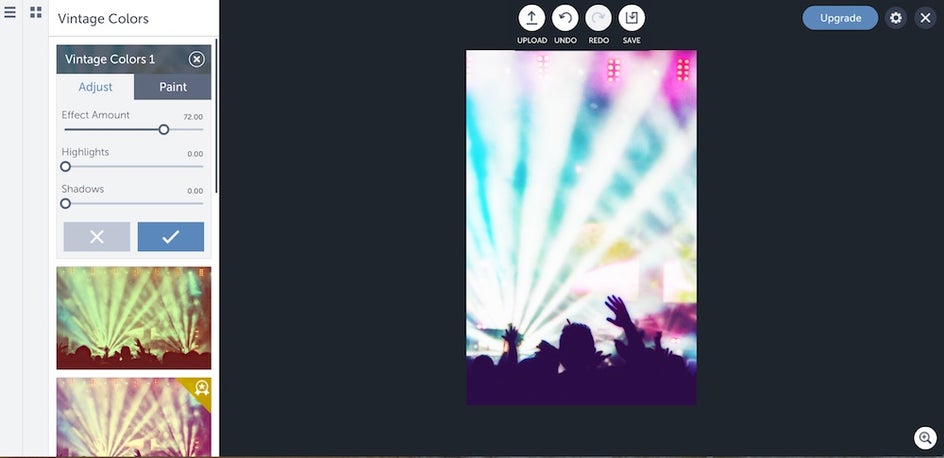
For purposes of this tutorial, let's do something clean and classic: Vintage Colors. Adjusting the sliders transforms the black areas into groovy purple. The subdued original photo now sports cool jewel tones.
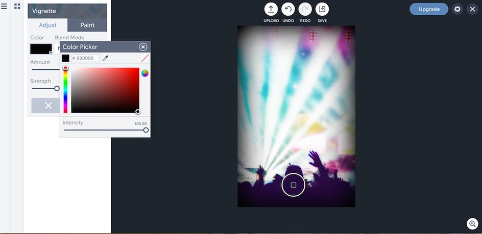
I like vignettes on posters, so I use the color picker tool to select a deep violet tone from the crowd area; applying that hue to the vignette gives the whole image a seamless look.
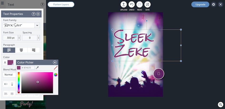
The color picker is also useful for text. A plum hue defines the band's nicely against the pale strobes, especially paired with a white outline (don't forget you can adjust the outline width as well).
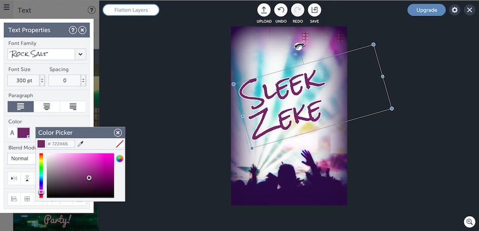
A straight alignment is rather boring, don't you think? This is rock and roll, it needs to be dynamic! Grab hold of the dot in the top center of the text box and give it a twist.
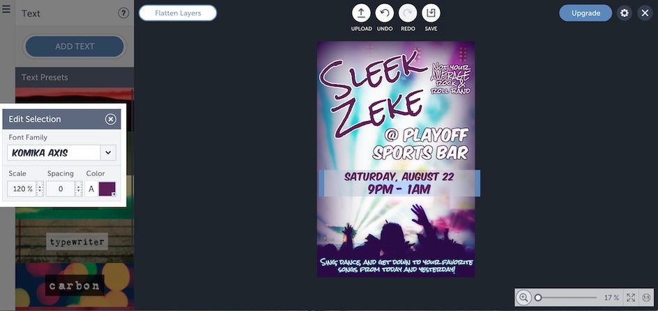
Keep adding text boxes until all the relevant info is in place. I stuck with the purple-and-white theme and reversed it for different pieces of text, creating visual interest while maintaining a consistent look. BeFunky offers its own fonts in addition to the ones on your computer: here I employed a stylish one for headlines and a more easy-to-read one for key information.
Handy tip: Within the individual boxes, you can select pieces of text and size them on a different scale than the other characters in the box. In this example, I've used the scale percentage tool to make the time 20% larger than the date. When I resize the text box as a whole, the ratio will stay in place.
Using BeFunky's tools, the final product dazzles, just like my band will at the show!
Want to take your creativity to the next level? Try your hand out at creating something amazing today: