Experiment With Typography for Effective Designs

When you’re creating graphics, there’s always a particular mood or theme that you’re trying to convey. For example, a photo quote will express inspiration, while a birthday party invitation screams excitement. While the imagery and color palette play a large role in communicating this mood, you also can’t underestimate just how powerful typography can be.
Different styles of fonts have different associations in our minds. Cursive fonts often portray elegance or romanticism, while a bold serif font can be seen as powerful and dominant. But how can you pair your main font with others in a way that doesn’t dilute your intended theme? And just as importantly, how can you pair fonts together so they still look cohesive?
Keep reading, because we’re going to cover everything you need to know about playing with typography so you can achieve your most effective graphic designs yet!
Font Pairing Basics
One of the easiest ways to play around with font pairings is to familiarize yourself with font families. Font families refer to the different categories of typefaces. The most common ones you’ve probably heard of include serif, sans serif, script, and decorative.
Each of these font families has unique traits that make them more suitable for pairing with other specific font families. For example, serifs (those with small stokes attached to each letter) pair really well with their direct opposite, sans serifs (those that don’t contain these stokes).
Script fonts, on the other hand, are more fluid and similar to handwriting. They’re best balanced out with serif or sans serif fonts. Similarly, decorative fonts have a cursive aesthetic. Like most font families, they look great when paired with a simpler font, such as a serif or sans serif.
Here are some other font pairing tips you should keep in mind:
- Play with weight. A heavy font works better for headlines while a lighter one is more suitable for your main body of text.
- Changing from regular to italic to bold can create different looks using the same font or font family.
- When it comes to mixing your typography, less is more. Featuring too many different fonts within a design can dilute or confuse your intended theme.
You can also check out our Ultimate Guide to Font Pairing to learn more!
Our Favorite Themed Typography Ideas
Remember how we said typography plays an important role in conveying your design’s chosen theme? We’ve included some of our favorite typography pairings below to show you how! You can even refer back to these next time you want to achieve the same mood in your own design.
Spooky
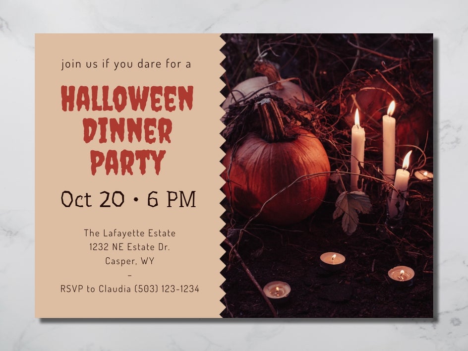
For something a little spooky, we’ve paired the aptly named Creepster font with Underdog, which still ties in with the Halloween theme without clashing. To keep the rest of the invitation cohesive and balanced, the remaining text is in the sans serif font Dosis.
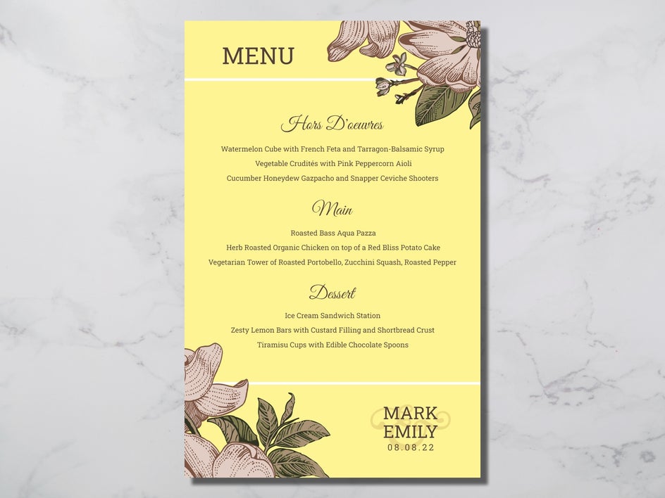
Elegant
This wedding menu is both elegant and romantic with its use of a decorative font paired with a traditional serif font. The menu subheadings use the popular font Great Vibes, while the remainder of the text is in the classic Roboto Slab.
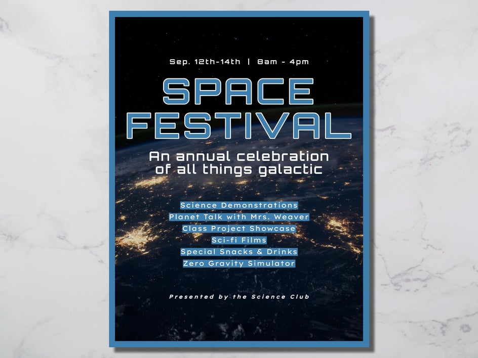
Futuristic
This flyer for a space festival captures the theme perfectly with its combination of two clean and futuristic fonts: Orbitron for the headings and subheadings, as well as Lexend Exa for the remaining text. Using more traditional or decorative typography would clash with the theme and make this flyer less effective for viewers.
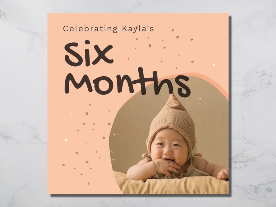
Childlike
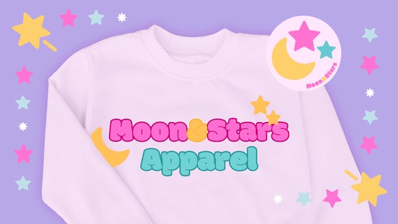
Using script fonts with a childlike aesthetic can also enhance the theme of a child’s birthday party invitation or any other age-related celebration. Take this design, for example, which uses the script font Gochi Hand paired with a more simplistic sans serif, Work Sans.
How to Experiment with Typography Using BeFunky
You can add typography to your projects across BeFunky’s entire creative suite, including the Photo Editor, Graphic Designer, or Collage Maker. The process for each of these remains the same, but for this example, we’ll be using the Graphic Designer.
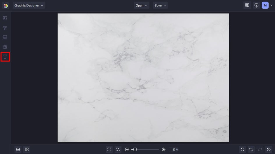
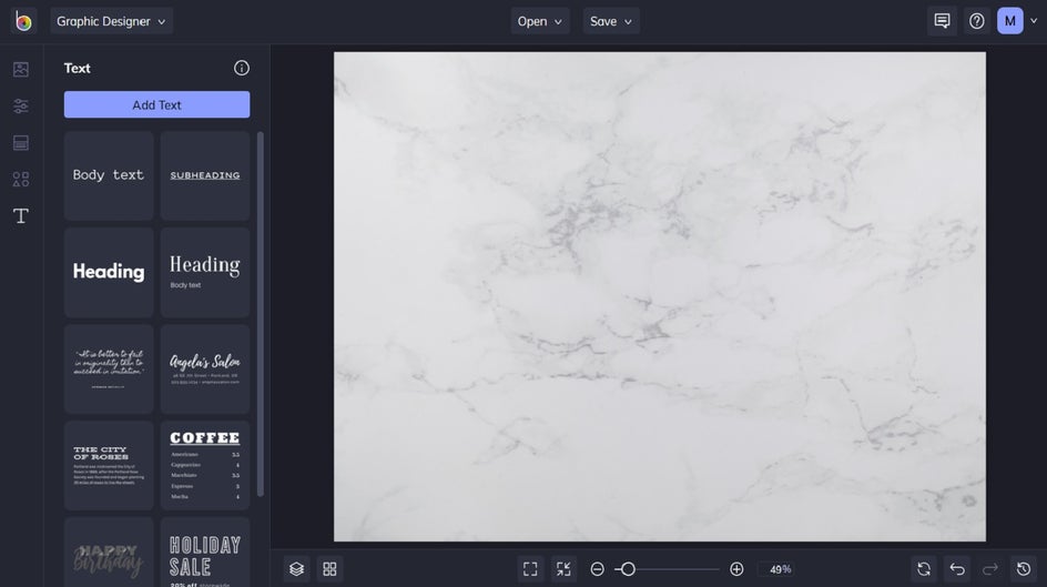
Step 1: Navigate to Text
Click on the ‘T’ in the main menu on the left to access the Text tab.
Step 2: Add Text
From here, you have two options: you can select one of the curated text patches, which already feature eye-catching font pairings. Or, you can click Add Text to experiment with typography from scratch.
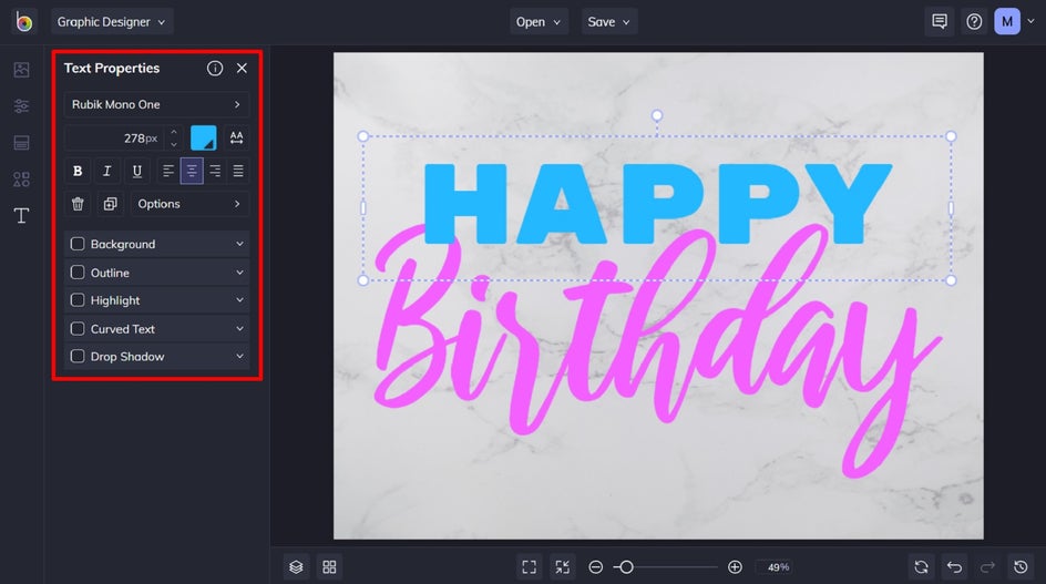
Step 3: Customize Your Text
To change what a text box says, simply click it twice and begin typing. When you click on a text box, you also have access to the Text Properties panel. You can change your text’s font at the top of the panel. You have access to a huge library of fonts of all font families to help you achieve your desired look or theme.
From the Text Properties panel, you can also customize your text in any way you see fit, including changing its color, spacing, adding a drop shadow, and so much more.
Pro Tip: BeFunky has an abundance of fonts to play with, but did you know that you can add your own fonts too? In the Choose a Font section, click the ‘+’ button to add your font files directly from your computer or Google Fonts. You can also remove fonts too.
Final Result
There you have it; a Happy Birthday text that’s filled with joy and excitement! Next, you can apply your typography to any background, collage, or template.

Take Your Typography to the Next Level
Once you understand the basic rules of font pairing, it’s easy to play around with different styles of typography. What look will you achieve in your next design? Thanks to BeFunky’s wide range of fonts and curated text patches, achieving eye-catching typography has never been more fun! Go on, start your next typography project in our Photo Editor, Graphic Designer, or Collage Maker to see for yourself!