The Ultimate Guide to Font Pairing
If you’ve ever tried adding text to an image or design, then you know just how difficult it can be to pair different fonts. After all, there are so many fonts to choose from, so knowing which ones look best together can seem like an impossible task.
Font selection plays a vital role in your design projects, however, as they help to set the right tone for the look and feel of your work. Gone are the days of font guesswork – it’s time to learn how to pair your fonts perfectly for your most effective designs yet!

Thankfully, we’ve put together this ultimate guide to font pairing to help you get your text just right. Learn about the different font categories and when to use them, plus be inspired by some of our favorite font pairings!
Font Pairing Basics
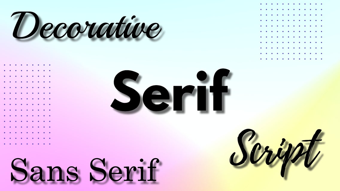
Before we get into which fonts pair well together, we need to talk about the four most popular categories of fonts: serifs, sans serifs, decorative, and script. The aim of font pairing is to choose different fonts (usually no more than 3) that create contrast in a harmonizing way. That’s why, when it comes to font pairing, opposites attract.
Without further ado, here’s what you need to know about serif, sans serif, decorative, and script fonts.
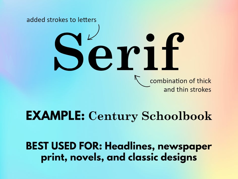
Serif Fonts
The word ‘serif’ refers to the small strokes attached to each letter. Serif fonts use thick and thin strokes to create a look that’s easy to read and traditional in appearance. This makes them ideal for use in novels and newspaper print.
In design, serifs pair really well with their direct opposite: sans serifs. Therefore, when in doubt, pairing a serif and sans serif font together is the quickest way to achieve text perfection.
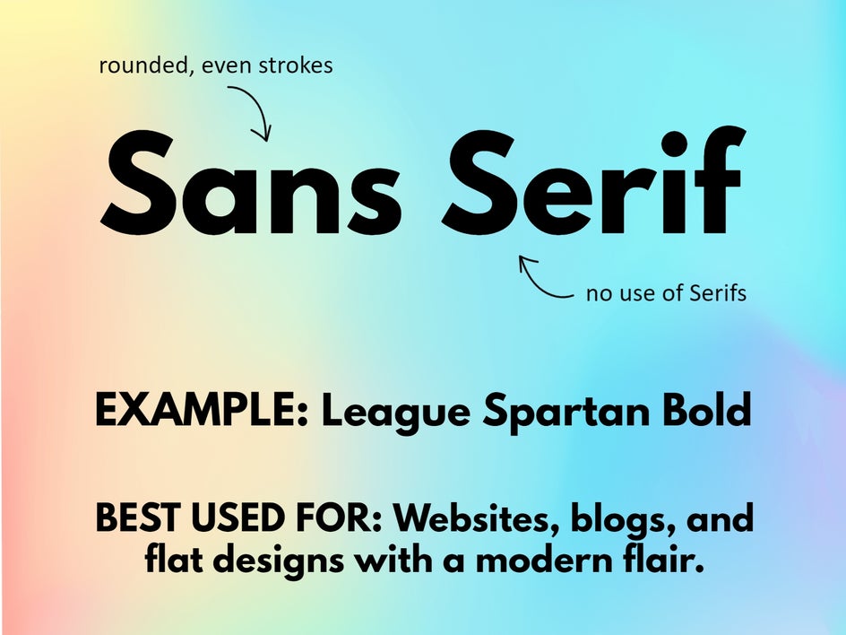
Sans Serif Fonts
A sans serif font is simply a font without any small strokes, or serifs, attached to each letter. Instead, these fonts use clean, minimal, and semi-rounded details. Their simplistic and modern aesthetic lends well to websites, blogs, and other flat designs.
Sans serifs have a warm and inviting feeling about them, all the while providing a sense of stability and seriousness.
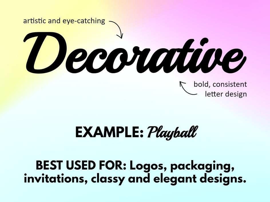
Decorative Fonts
You’ll instantly identify a decorative font for its cursive aesthetic. Decorative fonts provide more creative detail than serifs and sans serifs, which makes them a popular font choice for branding (such as logos), product packaging, posters, and more.
A decorative font typically acts as the focal point of a text-based design and can be paired with serifs and sans serifs as supporting text.
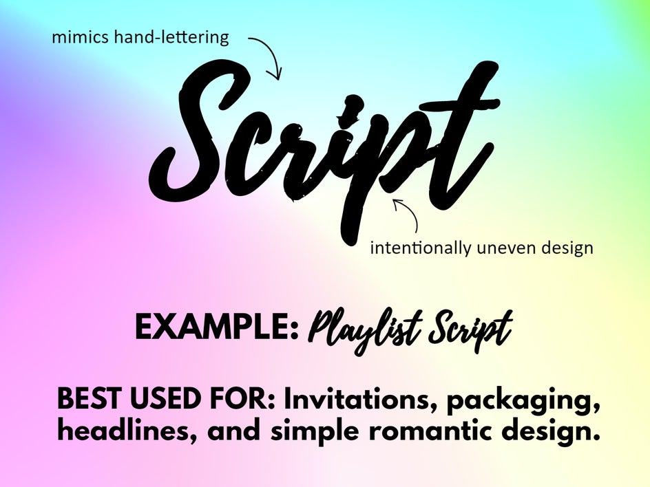
Script Fonts
Script fonts can be likened to the natural, organic style of handwriting. This makes them perfect for wedding invitations, greeting cards, and shorter headlines. While script fonts are often confused with decorative fonts, you’ll notice that their strokes are more fluid and uneven than their decorative counterparts.
Due to their artistic nature, script fonts are balanced well with serifs and sans serifs as supporting text.
12 Examples of Perfect Font Pairing
Now that you know the four most popular types of fonts and what they pair best with, it’s time to show you some font pairing examples. Here are 12 of our favorites, but remember, the possibilities of font pairing are endless!
You’ll find all of these fonts available in BeFunky, so if you’re feeling inspired, you can get started with your designs right away.
1. Events and Workshops
When creating advertisements for an event or workshop, the key is to choose a bold, yet clean, font for the headline. This allows your design to instantly capture a viewer’s attention, while remaining legible from a distance.
In this design, we've paired a serif header font (Oranienbaum) with an italicized serif subheader (Playfair) and another serif as the descriptive text (Lora).

2. Lifestyle Blog
Since webpages are flat, it's best to steer clear of decorative or script fonts as typeface headers. This is because blogs tend to perform better when the graphics and text have a clean design. Therefore, stick to your more legible serifs and sans-serifs for blog typography.
In this example, we've paired a serif font (Playfair) with two types of sans serif fonts: Open Sans as the subheader and Open Sans Condensed as the descriptive text.
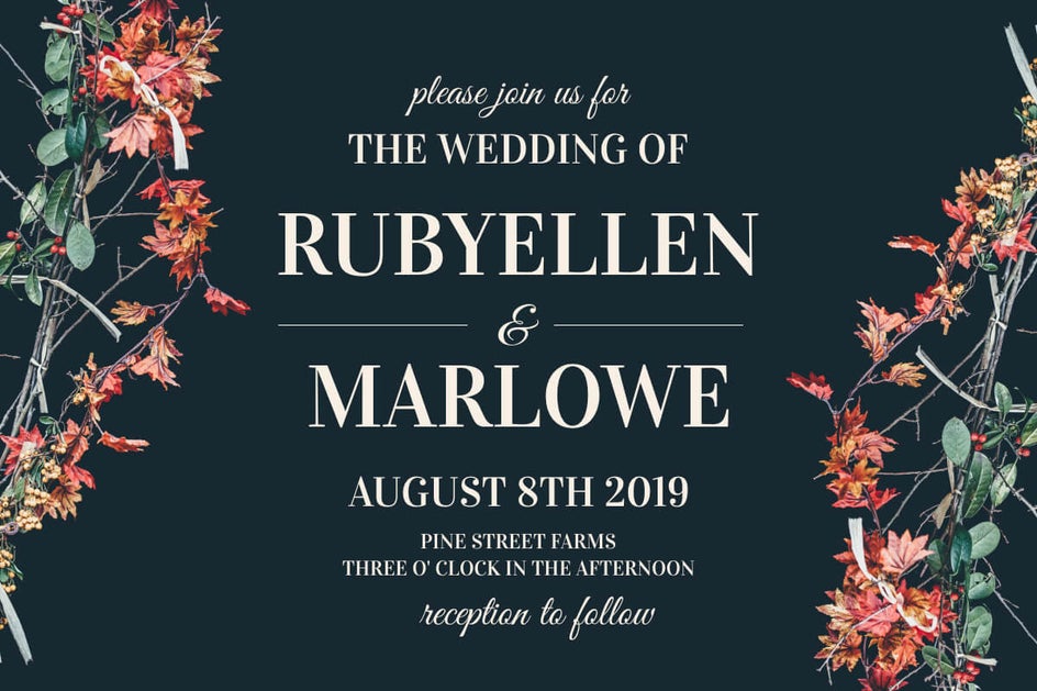
3. Romantic Wedding Invitation
Because of their more romantic nature, decorative and script fonts are commonly used in wedding invitations and accompanying stationery – particularly when accenting more classic fonts.
Below, we've chosen different sizes of the same serif font (Vidaloka) as the main text and accented with a beautiful decorative font (Great Vibes).
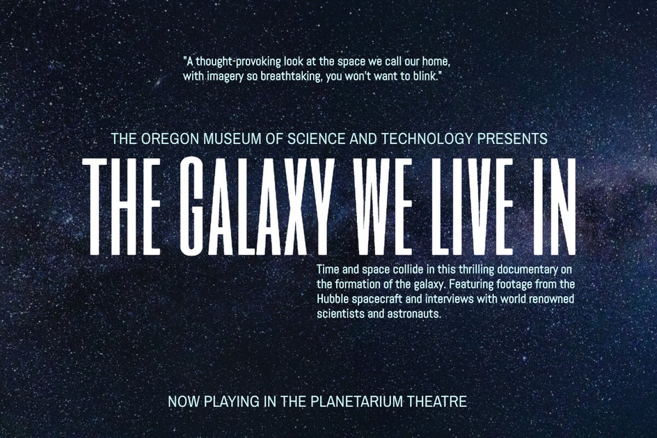
4. Cinemas and Plays
When it comes to designs for movies and plays, the focal point should always be the event title. Therefore, you’ll want to choose a font that not only emphasizes this main text, but which also ties in with the style of production, where possible.
In this example, we've chosen a bold serif font (Six Caps) to be front and center. Accented with other sans serif fonts (Archivo Narrow and Abel), the same tone is achieved throughout the design.
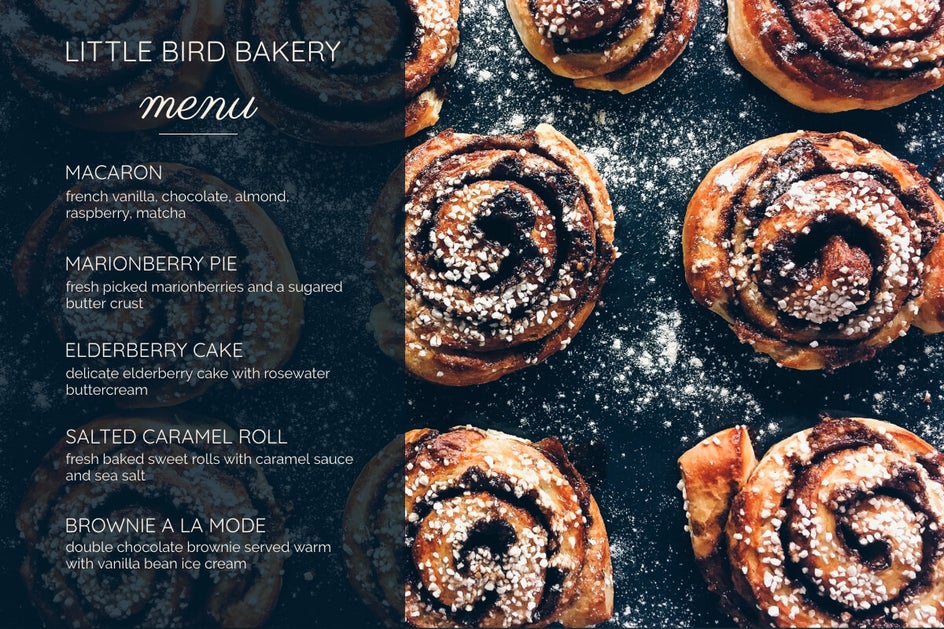
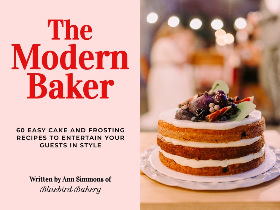
5. Bakery Menu
When you think of a bakery, two words often come to mind: warm and inviting. Therefore, when creating a menu for a bakery, the text should communicate these feelings to the viewer.
Take the menu below, for example, where two types of serif fonts (Quicksand and Raleway) describe the menu items and even showcase the bakery name. Additionally, a scripted font (Parisienne) indicates the type of design.
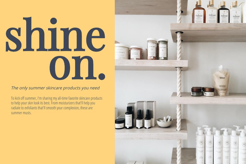
6. Adventure Magazine
A good serif font can create an exciting, yet classic feel – especially when you use font size and spacing to create a sense of hierarchy within a design.
In this example, we've chosen Merriweather to be front and center. Its traditional serif appearance makes it perfect for headline text within a magazine or newspaper. We've also chosen to introduce a sans serif (Cabin) for the description of the publication.

7. Recipe Book
They say you shouldn’t judge a book by its cover. Yet, the fonts used on any book cover really do set the scene for what readers can expect within its pages. Along with readability, you’ll also want to consider fonts that help to showcase the overall tone of your publication.
In this particular design, we've gone with three different types of fonts for a modern look. The main title is serif (Vidaloka), the subtitle is sans serif (Open Sans), and some supporting text is script (Petit Formal Script).
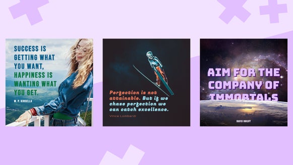
8. Inspirational Quotes
They say you shouldn’t judge a book by its cover. Yet, the fonts used on any book cover really do set the scene for what readers can expect within its pages. Along with readability, you’ll also want to consider fonts that help to showcase the overall tone of your publication.
In this particular design, we've gone with three different types of fonts for a modern look. The main title is serif (Vidaloka), the subtitle is sans serif (Open Sans), and some supporting text is script (Petit Formal Script).

9. Website Design
Website design is similar to blog design in that too much script or decorative text should be avoided. In fact, you'll want to keep things simple, especially if the website includes a lot of additional imagery, such as photos.
Your font pairings will be totally dependent on the type of website you're dealing with, however, in this example, a sans serif font (Questrial) acts as the page's major focal point and title. We kept things simple by using another sans serif (Raleway) as the supporting text.
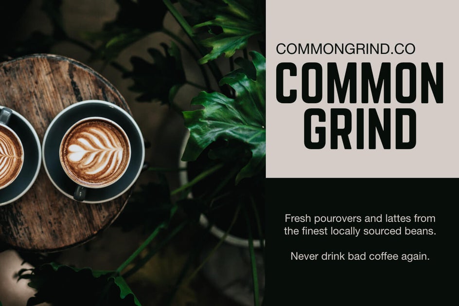
10. Modern Coffee Shop
A strong, eye-catching font for the company name is essential for a coffee shop or other retail business. When it comes to header text, any typeface will work, whether you're using a logo or just typing the name of the company on a website. It simply depends on the tone of the business.
To keep things neat and tidy, we chose a modern-looking sans serif for the company name (Norwester) and combined it with another sans serif (Helvetica Neue).
11. Fashionista
For fashion publications and blogs, you'll want a contemporary and captivating font as your header text to signify modernism, innovation, and style.
For the focal point in the example below, we've chosen a serif font (Abril Fatface). The ampersand is also in the same typeface as the other two words in the title, although it is smaller. This gives it a distinct and branded appearance. We also used an italicized serif (Arapey) for the subheader and combined it with a clean sans serif (Avenir Next).
12. Travel
When promoting a vacation, you'll want to entice viewers using clean and legible fonts that instantly gain their attention.
The typeface used throughout this design is sans serif, including Didact Gothic for the header and Karla for the remaining text. As you can see, using various text sizes allows you to bring crucial text front and center and create balance – even if it isn't visually centered on the design.

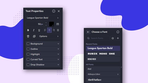
Adding Your Own Fonts to Befunky
A great part of using BeFunky’s creative suite is that, unlike most online creative platforms, you can add your own fonts to the collection. This means that in addition to our already extensive library of free fonts, you may now download fonts you love, install them on your computer, and use them in BeFunky for your design work!
This is particularly helpful when creating branded designs, as you can still use your brand’s typography throughout your work for cohesion.
Pair Your Fonts Like a Pro
Gone are the days of font painting confusion! Thanks to this in-depth guide and BeFunky’s easy-to-use fonts, you now have everything you need to go forth and conquer your next text-filled design.
Whether you work with the wide range of fonts already in our creative suite, or add your own fonts to your designs, there is no limit to your typography.
Head over to our Graphic Designer, Photo Editor, or Collage Maker to see just how easy it is!